Imagine for a moment that a donor is having dinner with a friend (let’s call her Amanda).
Your cause comes up in the conversation, and because Amanda is passionate about your nonprofit does, she pulls out her iPhone to show her friend.
But there’s a problem.
She can’t see anything on your site without pinching to zoom in. Not a good first impression.
Now obviously Amanda will be able to overcome this hurdle because of the trust she’s earned with her friend. But why put hurdles in front of your core supporters to begin with?
What is Responsive Web Design?
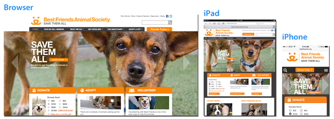
A responsive website automatically resizes in response to the particular device a viewer is using.
For example, here’s what Best Friends Animal Society looks like on various iOS devices:
Why is Responsive Web Design Important?
Unless you’ve been living under a rock with no Internet access, you’re probably well aware of the prevalence of mobile devices like iPads, iPhones, and Androids. In fact, more than half of the 1 billion people using Facebook access it from their mobile device.
In addition to the increased use of mobile devices, there’s also the change in behavior. More and more people are engaging with websites across multiple access points.
Finally, having a responsive website means that users won’t need to pinch, tap, or squint in order to view your website. Again, hurdles…
Three Steps to Developing a Responsive Website
After you’ve determined that your website needs to be more responsive, you should follow these three steps:
1. Have Clear Objectives for Mobile
Be clear about the purpose of your website on mobile devices, beyond the readability factor.
Ask yourself if a mobile user would have different needs than someone accessing your site through a browser.
For example, a person visiting a museum might want to easily browse showtimes and buy tickets on their iPhone. Having those pages prominently displayed on your mobile site would increase the likelihood that those transactions would occur.
Think about proximity, location and ease-of-use for mobile. Be clear about what you’d like mobile users to do when they access your website. And are these goals different for people using a browser?
2. Choose an Approach
There are generally three different approaches to achieving a responsive website:
- Create a Mobile Site––Creating a mobile site means creating a completely separate website for mobile devices. The great thing about creating a separate mobile site is the user experience. Because the site is designed for specific dimensions, the content will be easy to view and interact with. The downside is the expense and work. However, if you use WordPress, you can use a plug-in called WP Touch which automatically renders a mobile site, and allows you to select which pages to display on mobile devices and which pages to hide.
- Create a Mobile App––A mobile app that contains your website content can create even a better user experience then a mobile site. Users can access your content off-line, integrate location features, receive push notifications for any updates, and integrate much more tightly with Facebook and Twitter on the iPhone. The downside of a mobile app is the cost and maintenance, although there are ways you can DIY.
- Create a Flexible Width Website––This is the easiest and cheapest approach to creating a responsive website. This website uses the flexible with approach, meaning that it automatically resizes in response to the device.
If you use WordPress, most commercial themes are responsive out-of-the-box. If you don’t use WordPress here’s a great article on coding a fluid width into your website.
Test After Launch
You certainly want to test your mobile site before launch, but you also want to test after.
The reason why is that you have very little information (beyond your hypothesis) for how people will actually use your mobile website.
Testing your mobile sites after they go live will help you improve it much faster.